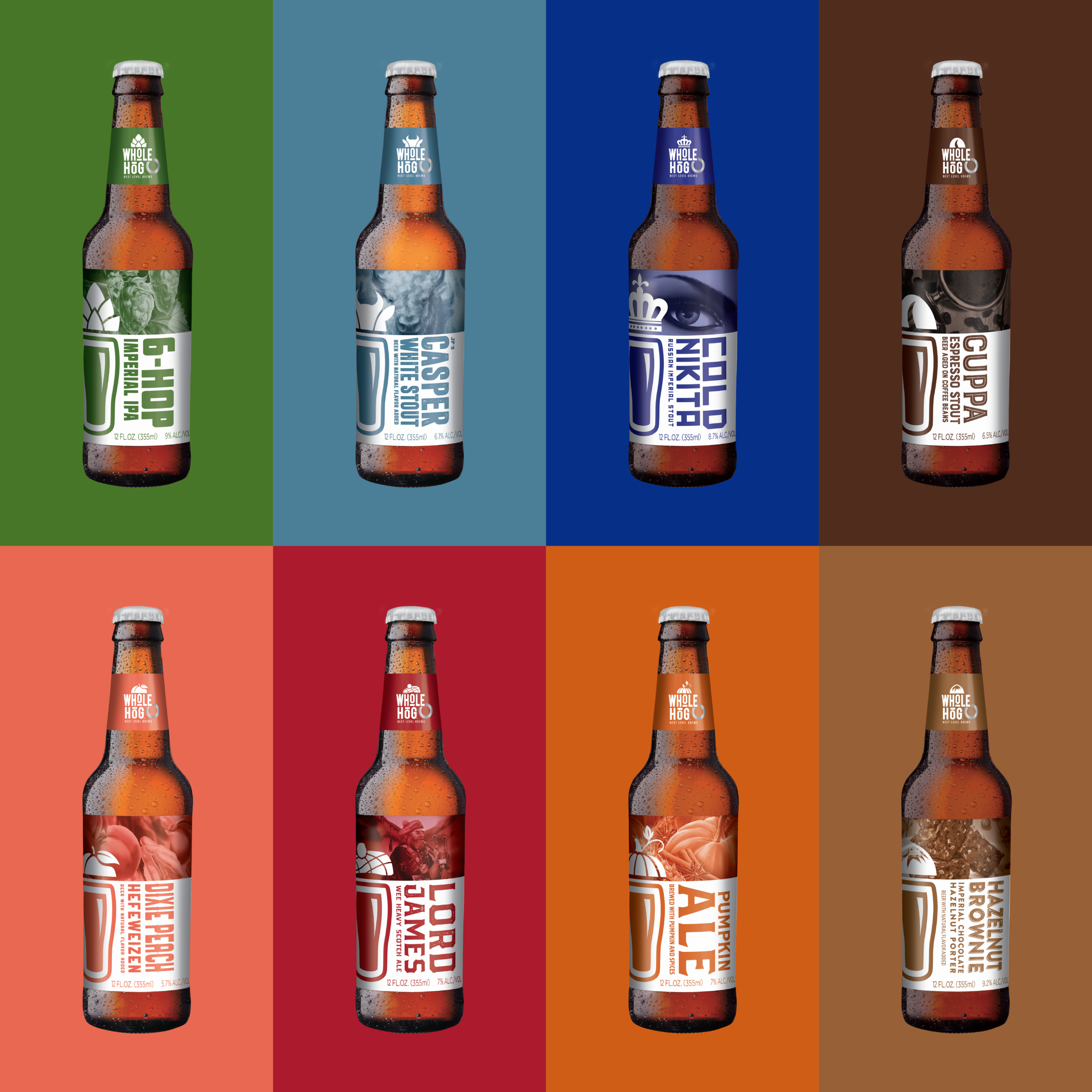
This creation of a package design architecture has given the brand a strong foundation upon which to build. By introducing a distinct, red brand band across all designs, a sense of cohesion and reliability has been achieved. From there, illustrations, type, and color are all used creatively to help tell a story that reflects the unique characteristics and use occasion of each individual beer, adding some personality and playfulness to the brand.
Since the original creative initiatives that Invok and Stevens Point worked on together, there has been a continual progression of design elements on their packaging in a top-down approach that keep things fresh yet familiar. This means that instead of completely redesigning labels every few years, small tweaks are made iteratively, such as changes to neck labels or label illustrations.
Expanding the Relationship
Recognizing increased consumer preferences and the desire for more options in the wine, beer and spirits category, Stevens Point added Ciderboys to their roster in 2012 – a hard cider that is available in select markets across the US. Thanks to the strong relationship established between Stevens Point and Invok, it was fitting for Invok to step in as their design agency and to help Ciderboys with packaging that promotes their diverse range of natural, gluten-free hard ciders.
“A fun challenge for us is the uniqueness of their brands, both in product and in creative execution,” says Tim McLaughlin, Creative Director (NYC) at Invok. “It is important for us to keep in mind the different personalities of each brand and the target audience – this allows for unique creative solutions without overlapping one another.”


