Nostalgia is About the Future, Not the Past


Whether you agree or not, the assumption in this headline (and its implications) is a very current topic of discussion for the marketing and design community. Wherever you look, it seems like what’s old is new again. From new CPG brands tapping into collective memories of the past to legacy brands paying homage to their heritage, the nostalgia trend is one that is being seen across CPG verticals.

To manage consumer’s enthusiasm for nostalgia and our client’s response to this interest, Invok has a way of thinking about a brand’s visual equity and an approach to evaluating all elements of a brand, including nostalgia. This approach incorporates a curated visual strategy model as part of our design process, one that relies on a review of iconic and often complex visual heritages from the past, along with insights and cultural influences of the present to ultimately help position brands for the future. It’s an approach that we have taken for countless clients over the years, and along the way, it has helped us develop some of our most iconic work. 

To guide these visual strategy and design development programs, we rely on three beliefs: 

  • Every brand identity has traced a unique path: This path, however long or short, has been influenced, since the brand’s inception, by its original identity elements and the decisions that brand management has made regarding their use. All retail package design programs must navigate their unique path to the future and nostalgia is a critical tool. 

    For new brands that are creating an identity for the first time, perhaps even more than existing ones, they must be sensitive to the historical norms of the category they are entering. The choice then becomes how do they want their new brand to relate to the existing brands in the category, and what “nostalgic” elements they feel they must share with existing legacy brands. 

  • Every brand category has clear and identifiable consumer expectations: These expectations are specific and vary from category to category. Whether it is in the CPG category, health and beauty or alcohol and spirits, each exists in different categories with consumer expectations that are inherent but also constantly changing. 

  • Every brand must identify and leverage its unique visual position relative to their category’s consumer expectations: This is equally true whether it has been in the market for several decades or is a new product innovation or line extension. 

Acting on our Belief

Below are two examples that demonstrate how Invok has used this three-pronged approach using the past, present and future as a guide to developing a client’s visual strategy. 

Club des Millionnaires 

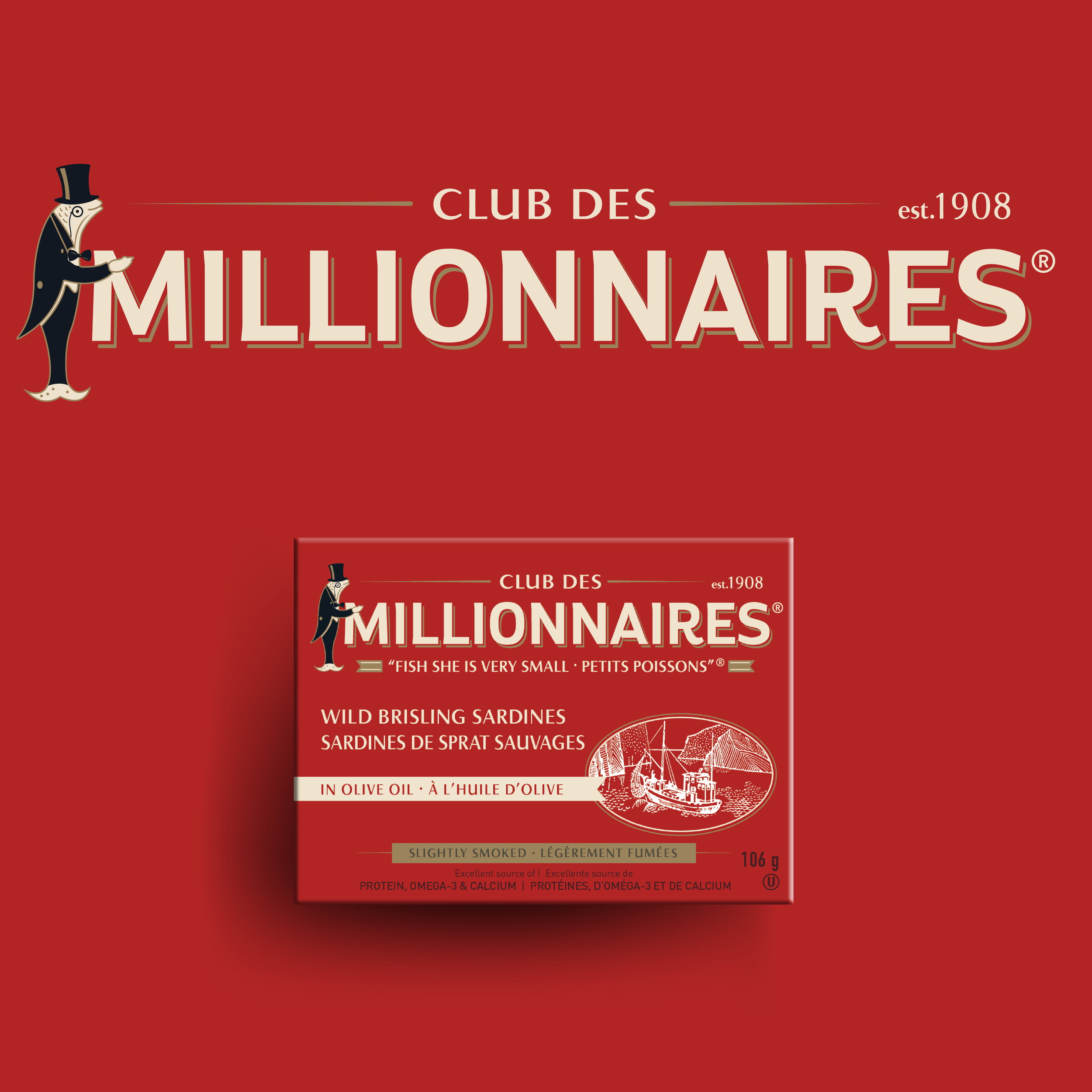
Club Des Millionnaires is a century-old brand that is full of personality and heritage. However, over time, the package designs became mismatched, and the brand’s identity began to show its age. When Ocean Brands acquired Club Des Millionnaires, they asked Invok to perk up the little fish with a brand refresh.  

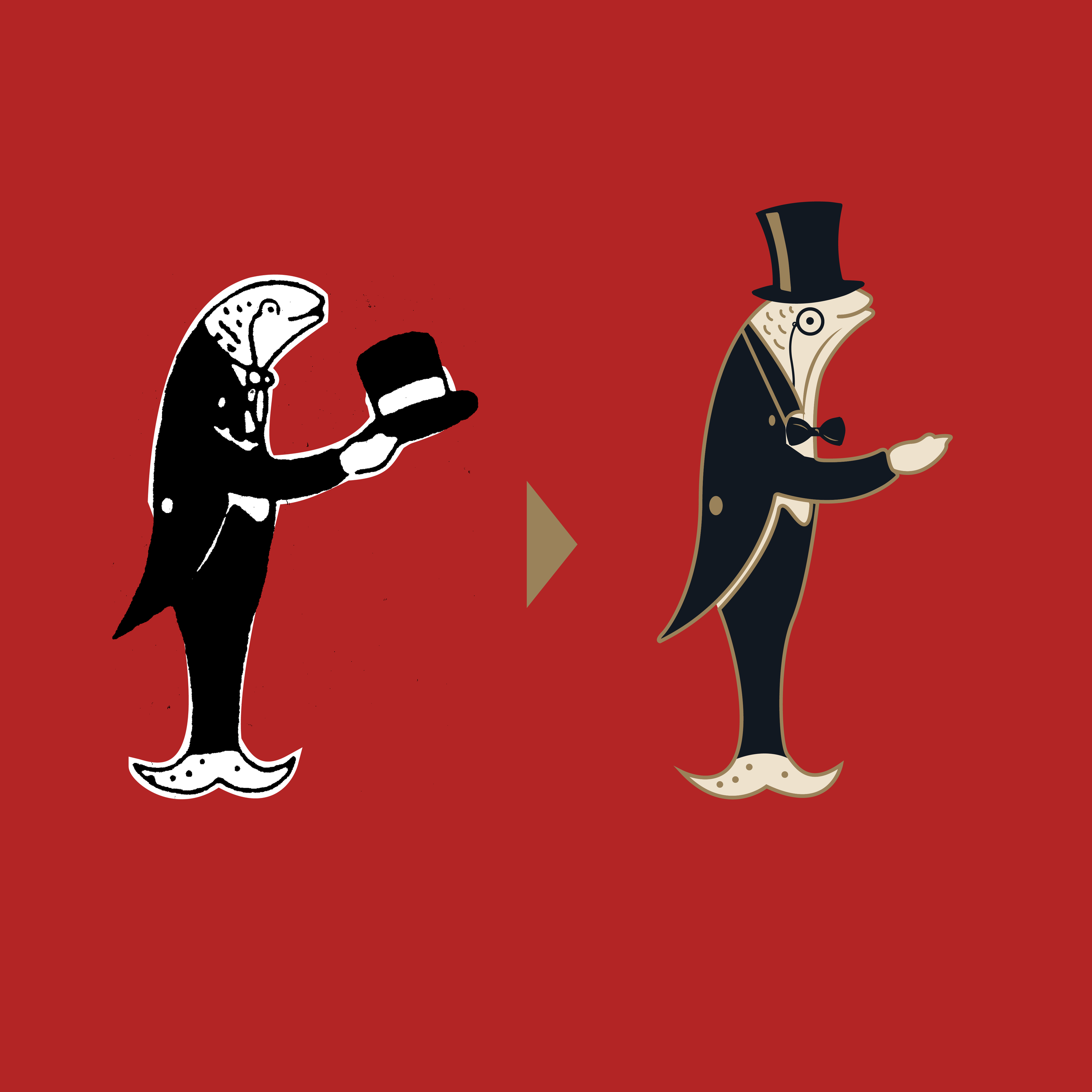
When a brand has this much legacy, it has earned its equity and should retain its character. For us, that meant keeping the name, the sardine brand mascot, and other elements from old package designs.  

Building upon that strong foundation, we wanted to elevate the brand and better communicate the product’s premium quality, while also tapping into the nostalgic past the brand hearkens back to. The sardine character, for example, now wears his top hat, instead of gesturing, hat-in-hand, to the consumer. He appears to stand more upright, and he is gold instead of white. He offers his hand as an invitation. Combined, these elements all give the impression of a premium experience.  

The brand identity typeface was also updated, and so did its shape. It went from a black and white arc, outlined in black, to gold with a light shadow, thicker lines, and a fishtail on the R for personality. The new logo looks more regal when paired with the attentive sardine character, and has captured the brand's heritage, whimsy, and premium quality. 

Additionally, other elements of the packaging were tweaked, such as the pencil sketches, to match the brand’s simplicity and elegance and give it an even more artisanal, nostalgic look and feel. 

Darigold

Founded in 1918, Darigold is a cooperative of dairy farmers in the US Pacific Northwest. While the brand has a strong heritage and reputation, they were looking to update their identity and brand impression at shelf to excite customers while maintaining strong brand equity.  

Invok embarked on an extensive design process that considered the past, present and future of the brand. With a goal of celebrating the natural beauty and richness of the Pacific Northwest and emphasizing the goodness that comes from dairy products that are produced there, we created a new brand identity system and package design that would provide a solid foundation for the brand to build upon. 

Our identity design celebrates the deep, Pacific Northwest roots of the cooperative's 550+ family farms while maintaining key equities of the past. The color red and doily remain from the original, creating a uniquely nostalgic, recognizable approachable personality, while updated font and the removal of the ribbon adds a contemporary nuance to the identity. Tying it all together is the introduction of a mountain range, once again paying homage to Pacific Northwest and highlighting a point of differentiation for the brand.   

For the packaging design, a tiered identity system provides a framework for everyday milk products and future innovation in premium and performance. The system allows for some variation among different product lines but ensures that key elements remain consistent. Approachable illustrations elicit a sense of familiarity and sentimentality that furthers nostalgic look and feel of the Darigold brand.  

Want to learn more about nostalgia in packaging design and how to incorporate the past, present and future to set your brand apart? Get in touch today!