details in the design: campbell's
You'd need a thousand words, at least, to explain who you are. Same with a brand. And it's probably TL;DR anyway. That's why in branding, we use the shorthand of graphic design instead.
Welcome to our Details in the Design series, where we explore how our graphic design work brings a brand identity to life.
Grow a better world one seed at a time
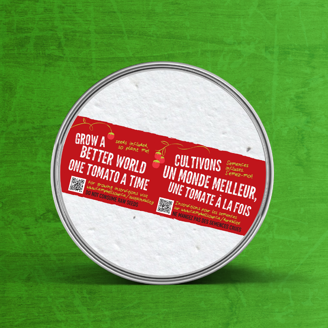
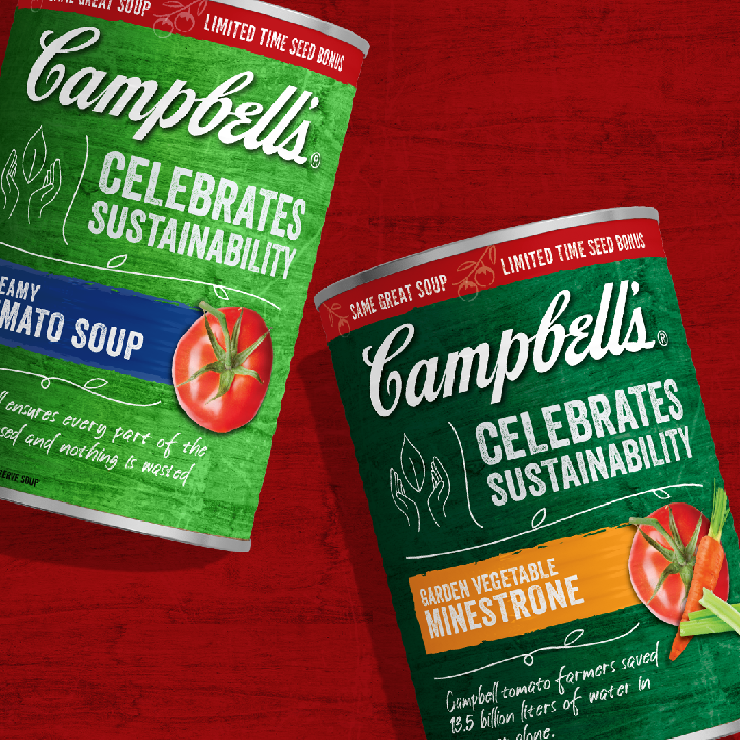
Campbell's is, and always has been, a company committed to sustainability. In the spring and summer of 2021, to educate the consumer about their farming practices, the company ran a limited-time offer of Garden Vegetable Minestrone and Creamy Tomato Soup. This offering included a can-topping coaster of tomato seeds for the consumer to plant. To highlight this campaign, they asked us to design the new label and can-topping coaster.
Package design
The red and white Campbell's label is world-famous, and we don't often have the chance to work with such a design. So, how did we imagine it for this limited-time offer yet keep it unmistakeably Campbell's? Could it be Campbell's and not red and white? What could we do with the logo? How could we support the flavor message and celebrate sustainability?
In the final design, very few specific details harken back to the iconic label soup can. Yet, our limited-edition offering can design is clearly Campbell's while also communicating the message of sustainability. Here is how we did it.
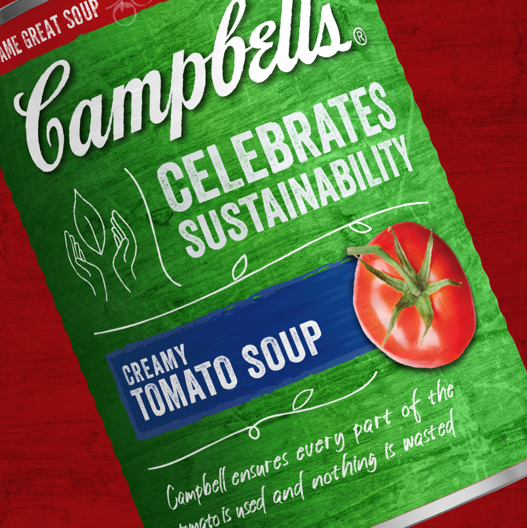
We combined layout, iconography, typeface, contrast, and photography to reinforce the sustainability message. The Campbell's logo has center-stage, with colors chosen to communicate flavor rather than brand. The giving-hands icon, offering a seed, shares the message of sustainability in an approachable, Zen, and nurturing feel. The linear elements that separate the type are intentionally natural. The green background has a texture of handcrafted paper. The photography brings visual identification and rich flavor to the picture. Overall, the design is approachable, natural, and informal.


